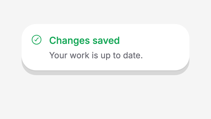
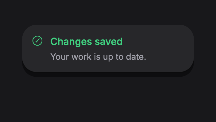
Import
import 'package:flutter/widgets.dart';
import 'package:fluttyui/fluttyui.dart' as ui;
Usage
Call this from a callback with a context below FluttyApp, which provides the overlay.
ui.Toast.show(
  context,
  message: 'Your changes have been saved.',
  variant: ui.ToastVariant.success,
)
API Reference
The declarations below match the current FluttyUI source. Types are shown without the optional ui. import prefix.
void show
static void show(
  BuildContext context, {
  required String message,
  ComponentSize? size,
  String? title,
  ToastVariant variant = ToastVariant.defaultVariant,
  ToastPosition position = ToastPosition.top,
  Duration duration = const Duration(seconds: 3),
  Widget? icon,
  String? actionLabel,
  VoidCallback? onAction,
  Color? backgroundColor,
  Color? foregroundColor,
  Color? descriptionColor,
  Color? actionBackgroundColor,
  Color? actionForegroundColor,
  double horizontalMargin = 12,
  double verticalOffset = 8,
  double? borderRadius,
  double maxWidth = 480,
  bool dismissible = true,
});
void dismiss
static void dismiss();Application Setup
Place components under FluttyApp to provide theme, navigation, localization, and overlay defaults. Use theme tokens for shared appearance settings.
Source
lib/src/widgets/overlays/toast/toast.dart
This reference is generated from the Toast declaration in the FluttyUI core checkout. The component catalog lists the other available building blocks.